Earthy Color Palette for Olive Green
For Olive Green (#708238), this olive green earthy color palette uses Dusky Plum, Warm Taupe, Moss Green, Seafoam Teal, and Muted Rose as a role-based system. It is designed for natural packaging, warm interior materials, with each color assigned a practical role instead of acting as a generic swatch set.
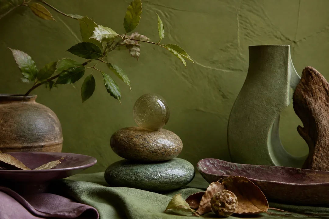
The best calculated colors with Olive Green are Dusky Plum, Warm Taupe, Moss Green, Seafoam Teal, and Muted Rose. This palette is designed for clay, leaves, stone, linen, wood, and natural textures.
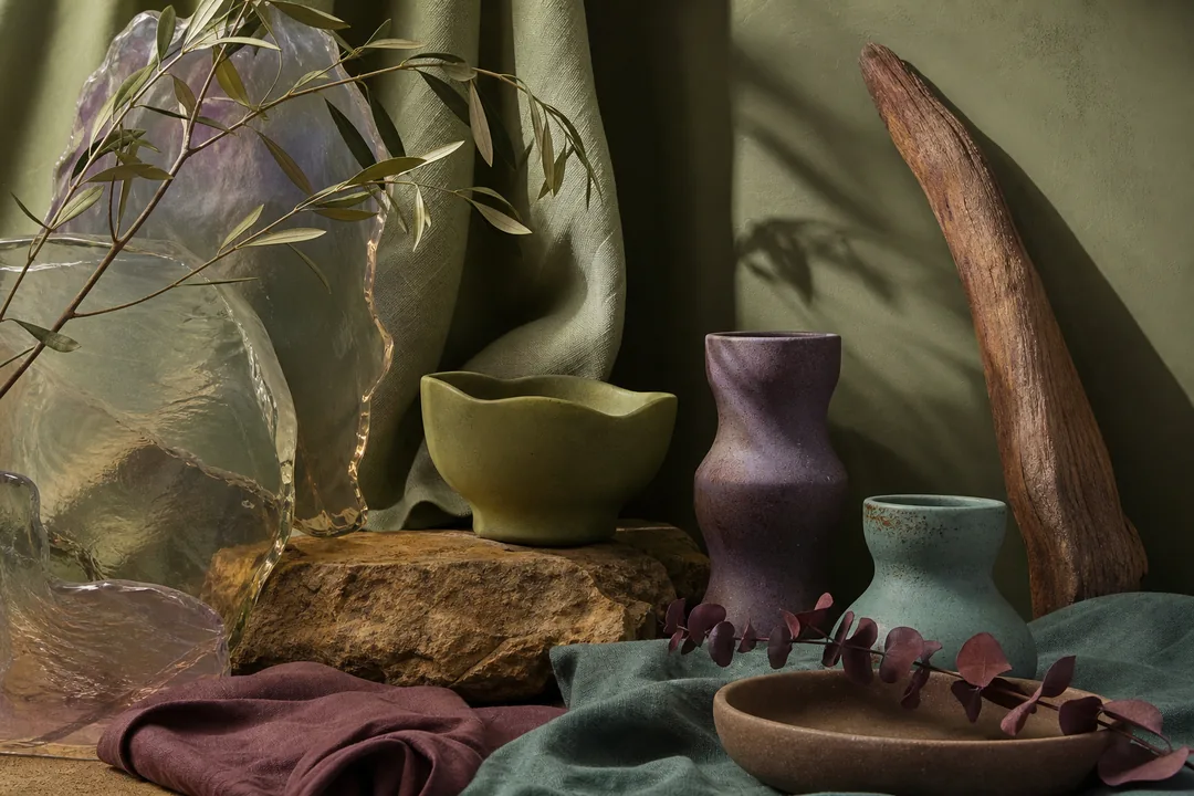
Olive green feels like a quiet walk at the edge of the woods to me. I love how it can read soft and earthy one moment, then almost elegant the next, depending on the light and what’s sitting beside it. There’s a calm, worn-in quality to it that makes a room or an outfit feel settled without looking like it’s trying too hard. My favorite pairing is olive green with warm taupe, because the two seem to breathe together and keep everything easy and gentle. I’ve also been drawn to it beside muted rose, which adds a little warmth without interrupting that quietness. I’d avoid putting olive green next to anything bright and cool-toned, because that kind of contrast can feel harsh and strip away what I love most about it.
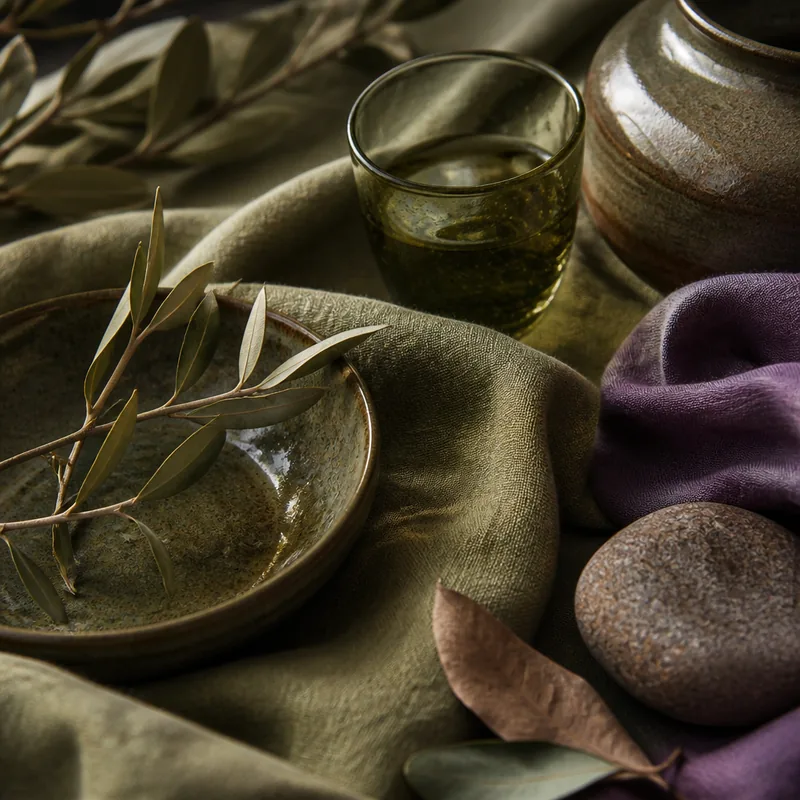
The 5 matches
Clay, linen, and wood balance
The palette works because Olive Green sets the visual temperature while the supporting colors shift value, saturation, and role. Dusky Plum gives the scheme an immediate partner, Warm Taupe softens the transition, and Muted Rose adds a controlled endpoint. For earthy / nature use, that means the palette can move from large areas to small accents without every color fighting for attention. The strongest earthy palettes feel material, not decorative: clay, linen, wood, stone, and botanical cues should each have a purpose.
Nature-inspired role map
Use this as the base material so the earthy / nature palette has a clear job for each color.
Use this as the clay or mineral tone so the earthy / nature palette has a clear job for each color.
Use this as the linen or fabric so the earthy / nature palette has a clear job for each color.
Use this as the wood accent so the earthy / nature palette has a clear job for each color.
Use this as the botanical accent so the earthy / nature palette has a clear job for each color.
Use this as the deep soil note so the earthy / nature palette has a clear job for each color.
Where earthy colors work
Value and texture mistakes
- Avoid too many muddy mid-tones at the same value.
- Add one clearer light or dark note so the palette does not flatten.
Readable as a background?
| Text | Ratio | Verdict |
|---|---|---|
| #000 Black | 4.94 | AA pass |
| #FFF White | 4.25 | Fail |
Use dark text on #708238 — white falls below the 4.5:1 minimum.
Use official WCAG contrast guidance when a palette will carry readable text. WCAG contrast guidance.
Copy-paste CSS
/* Olive Green palette — generated from #708238 */
:root {
  --olive-green: #708238;
  --dusky-plum: #605584;
  --warm-taupe: #88755B;
  --moss-green: #5F885B;
  --seafoam-teal: #789E8E;
  --muted-rose: #77585A;
}
Use this color in Paletier tools
More with this palette
FAQ
What is the best olive green earthy color palette?
A strong olive green earthy color palette pairs Olive Green with Dusky Plum, Warm Taupe, Moss Green, Seafoam Teal, and Muted Rose. This set gives the base color clear companions for contrast, accents, and quieter support.
Where does Olive Green fit in a earthy / nature system?
Use Olive Green as base material and avoid giving every support color the same amount of space. The role map keeps the palette practical.
Which pairing mistake should I avoid with Olive Green?
Avoid too many muddy mid-tones at the same value.
Is #708238 readable as a background?
It can be, but text color must be selected from the measured contrast results rather than by appearance alone.