Lavender Wedding Color Palette
For Lavender (#E6E6FA), this lavender wedding color palette uses Ivory, Pale Blue, Lilac, Pearl, and Mint as a role-based system. It is designed for floral direction, invitation suites, with each color assigned a practical role instead of acting as a generic swatch set.
The best calculated colors with Lavender are Ivory, Pale Blue, Lilac, Pearl, and Mint. This palette is designed for florals, stationery, table settings, ribbons, and soft event styling.
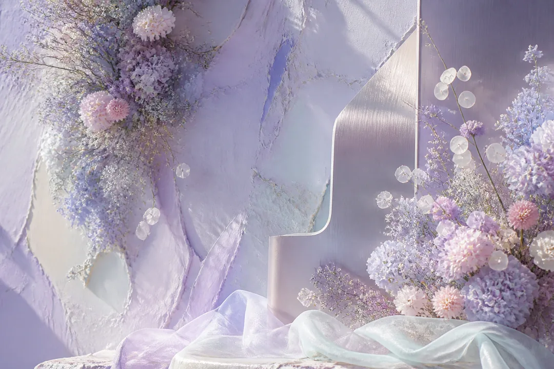
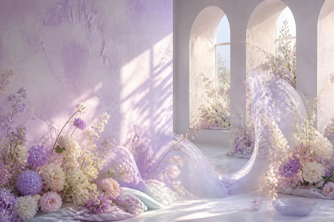
Lavender has always felt like a quiet kind of happiness to me. It reminds me of early evenings when the light turns soft and everything settles down a little, and I find that mood genuinely comforting rather than just pretty. There is something about it that feels fresh and airy without ever turning cold. My favorite pairing is lavender with ivory, because together they have a calm, warm feeling that never seems to try too hard. I would avoid putting lavender next to anything too sharp or saturated, since those colors can crowd out what makes it lovely in the first place. It really does best when it has a little space around it.
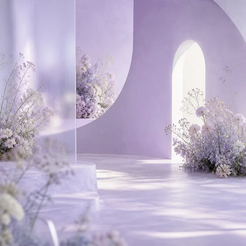
The 5 matches
Soft event logic
The palette works because Lavender sets the visual temperature while the supporting colors shift value, saturation, and role. Ivory gives the scheme an immediate partner, Pale Blue softens the transition, and Mint adds a controlled endpoint. For wedding / romantic use, that means the palette can move from large areas to small accents without every color fighting for attention. Let one color carry the floral mood while quieter companions handle stationery, textiles, and table details.
Ceremony and table roles
Use this as the main floral so the wedding / romantic palette has a clear job for each color.
Use this as the stationery so the wedding / romantic palette has a clear job for each color.
Use this as the fabric so the wedding / romantic palette has a clear job for each color.
Use this as the metallic accent so the wedding / romantic palette has a clear job for each color.
Use this as the table detail so the wedding / romantic palette has a clear job for each color.
Use this as the evening depth so the wedding / romantic palette has a clear job for each color.
Where this wedding palette fits
Sweetness and saturation mistakes
- Avoid overly saturated reds near the base color if you want a soft romantic mood.
- Balance sweet colors with a neutral or muted support tone.
Readable as a background?
| Text | Ratio | Verdict |
|---|---|---|
| #000 Black | 17.06 | AAA pass |
| #FFF White | 1.23 | Fail |
Use dark text on #e6e6fa — white falls below the 4.5:1 minimum.
Use official WCAG contrast guidance when a palette will carry readable text. WCAG contrast guidance.
Copy-paste CSS
/* Lavender palette — generated from #E6E6FA */
:root {
  --lavender: #E6E6FA;
  --ivory: #EEEEDD;
  --pale-blue: #DEE3ED;
  --lilac: #E4DEED;
  --pearl: #EADCEF;
  --mint: #DEEDED;
}
Use this color in Paletier tools
More with this palette
FAQ
What is the best lavender wedding color palette?
A strong lavender wedding color palette pairs Lavender with Ivory, Pale Blue, Lilac, Pearl, and Mint. This set gives the base color clear companions for contrast, accents, and quieter support.
Where does Lavender fit in a wedding / romantic system?
Use Lavender as main floral and avoid giving every support color the same amount of space. The role map keeps the palette practical.
Which pairing mistake should I avoid with Lavender?
Avoid overly saturated reds near the base color if you want a soft romantic mood.
Is #E6E6FA readable as a background?
It can be, but text color must be selected from the measured contrast results rather than by appearance alone.